Bing Maps
Most of us are using Google Maps, but a few years ago Microsoft also went into the race and created its own version of the maps named after its Bing search engine. From Excel 2016 exists an add-in with the same name that you can use to display charts on maps. It allows you to display data, in a form of charts, positioned on maps that can be customized to the desired report layout.
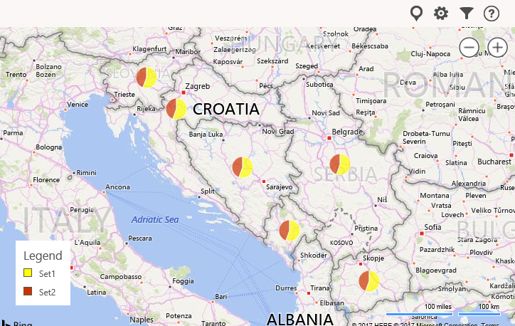
To demonstrate how Bing Maps work I will use the statistics of the visit to the “Excel Kitchenette” site in the first quarter of 2017. I created a table showing the visits by countries in the region from where the visits came from. We create a map by clicking on the Insert ribbon, then clicking on the Bing Maps icon. A window will open where you need to click on the Insert Sample Data button again to add data. We will add data from the table, and if we want to change the range of data should click on the first icon on the left side of the upper right corner of the object.


By clicking on the icon that resembles a gear, we open the Settings menu. In this menu, we can change the type of chart, color of the view, the type of folder, and whether the legend will be displayed.

In the upper right corner, second from the right, there is an icon that resebles a funnel. By clicking on that icon it opens the menu to filter the displayed data. The last icon, marked with a question mark, returns us to the start menu.
Depending on the original data, the Bing Maps add-in allows you to create vibrant interactive charts.