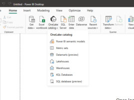
Visual Calculations

If you want to present a report based on data, you will do so by connecting to the source, purifying, modeling it and then adding appropriate visualizations. As part of the modeling process, we often created measures and calculated columns by writing DAX statements. In a similar way, we were able to add Quick Measures. Now there is an even easier way, and that is to create calculations within a visual…

New formatting options

Power BI Desktop, in its December edition, brought several new options for formatting Column and Bar visualizations, which we can use to make them much more functional and beautiful. In addition to this option, this “recipe” will show some new features that have been added to the data labels option. Relax and enjoy, here are some interesting contents…

New Slicer visual

Slicers are interactive objects used to filter pages or the entire Power BI report. They haven’t changed much since their inception, and since they represent an essential component of the report, they got a small facelift. Since November, a new Button Slicer visualization has appeared, which has the properties of traditional slicers, as well as some additional formatting options that make it much more beautiful. Let’s see what it has to offer!

Ribbon visual

Ribbon is a new visualization that has recently become part of the Power BI reporting platform. When is it used? If you want to show some indicators, for example sales revenue or total costs in relation to time, you will use either a Line or Column chart. If you hesitate between these two visualizations, you can use Ribbon, which represents the best of both!

Calculation Groups

Calculation groups is a new option within the Power BI Desktop application that allows us to implement DAX calculation groups within the data model. They serve to simplify calculations when we use similar DAX expressions, where only the variable (expression) that appears in them varies. By adding them, the model is automatically optimized by removing implicit measures.