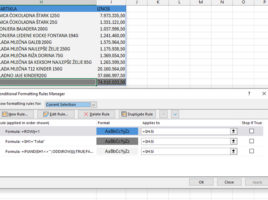
Bullet Chart

Bullet is a type of Column or Bar chart where we display series one above the other, and later in their display settings we determine the way the series overlap. This is a simple chart that is suitable for comparing one larger and one smaller size, e.g. Budget and Actual sales values. How to create this type of chart you will find out in the following “recipe”…

Budget vs Actual chart

“Actually an ordinary story, like Cinderella”… these are the words of an old hit from the ’80s, and they came to my mind as an illustration of what I want to describe in this text: a comparison chart of budgeted vs actual. If we use the display of data on the secondary axis, we can easily compare planned and realized values, which can be important for displaying intuitive reports.

Picturesque labels

When we make charts in most cases we’ll use text labels, numbers, dates, percentages etc. to display categories on the x axis. Sometimes descriptions are too long, so we have to work in different ways to display them in an adequate manner. Could we use something that describes them more closely such as a currency symbol, an envelope, a smiley face? In this “recipe” you will learn how to add different symbols to a table or chart.

Data Visualizer

Do you like Visio? It is an application that essentially belongs to the Microsoft Office, but is purchased separately. I used it to draw diagrams, but the number of objects it offers indicates that it is applicable in many activities where some type of design is performed. Recently, there is an add-on that allows you to easily create Visio diagrams within an Excel document. It’s called Data Visualizer. Let’s see how it is used!

Illustrate your report

Icons are illustrations that we first encountered when Office 2019 appeared. Although we could find a multitude of icons, divided by categories, Office 2021 has significantly improved this segment so that now, in addition to a rich icon gallery, you can add images, transparent photos of people, stickers, or other vector images that can enhance the look of your report. Let’s see how this is used!