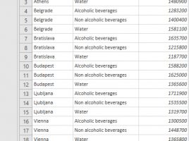
Advanced data grouping

In one of the previous “recipes” we talked about how to use the Excel GROUPBY function. On that occasion, you could find out how to use it in one of the standard scenarios of its application, and now you will learn how to use it in a slightly more advanced way. To begin with, how you can group by two or more dimensions, and then how to display percentages, determine the depth of the calculation, and so on.

Function GROUPBY

If writing SQL queries is in your job description I am certain that you, in great extent, inside SELECT command, use a GROUP BY clause that allows you to group row values by a given column and then apply an aggregation function, e.g. SUM, COUNT, AVERAGE, MIN, MAX… I have good news for you: we can achieve almost the same thing within an Excel report by using the GROUPBY function…

Group By option

Power Query has features that allow you to group and aggregate data in a similar way as when writing T-SQL structures, without writing a single line of code. Therefore, the process is much faster and easier. Grouping can be done by one or more report dimensions, and the order is determined in a similar manner as when sorting. Also, multiple data aggregation functions are supported as well as possibility of multiple aggregation…

Grouping visuals

When working with graphical objects in MS Office applications there is often a need to integrate multiple objects within one group so that we can move and manage them more easily. As of August 2019, Power BI Desktop has the option to group two or more objects, and in the text that follows you will be able to see how it is used.