Enhance PowerBI reports
Programmers usually don’t care too much for report’s look, whilst those who watch the reports equally care for their clarity and appearance (correctness is assumed). PowerBI possesses several tools that can be used for enhancing reports. In my opinion it can still be much better. Nevertheless, from version to version PowerBI development team is adding new functionalities and now it is quite better comparing its beginning.
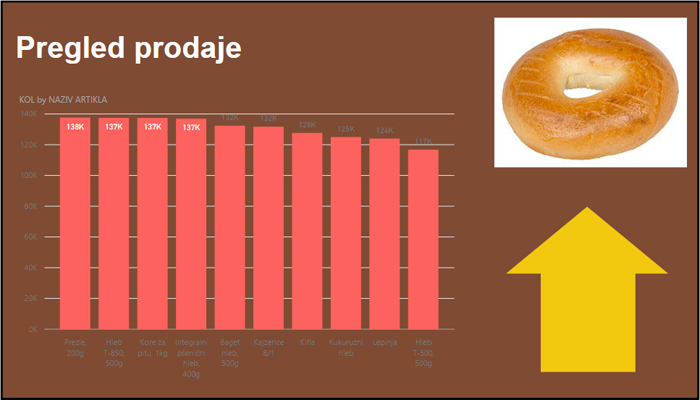
Maybe it is the best to show how these things work in practice. We’ll add a dataset containing sales transactions of a bakery retail business and make a simple Column Chart. For beginning, let’s format its appearance. By clicking the roller icon a group of options for formatting will show. They offer you to show or hide axes, change column colors (for all of them simultaneously od each column individually), add data labels, change background…
Home ribbon contains Insert group that holds several options by which we can add graphical objects. Text Box is used for adding text, mostly titles.
By choosing Image we can add images, and Shapes options enables adding various shapes like: rectangle, ellipse, arrow etc. After adding such objects Format ribbon will become available. It has several options for positioning (Bring Forward, Bring to Front, Send Backward, Send to Back) and alignment (Align, Distribute). With a little imagination and effort you can use them to create beautiful and functional reports.