Fields for visualization
Various visuals, whether they are tables, cards or charts, have different fields that can be used to adjust their look within the report. We perform this action by dragging dimensions and measures to these fields. In this “recipe” you will be shown usage of fields, depending of common visuals, and how to use them to form quality reports.
Table is a simple visual that is often used. It only has the Value field, and by dragging dimensions into this field and changing their position a report is being made. A little more complex visual is called Matrix. It shows the matrix, which resembles Pivot table report. By dragging dimensions to the Rows, Columns, and Values fields, we get the report in a similar way as when we create Pivot table.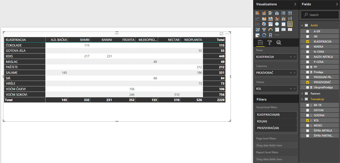
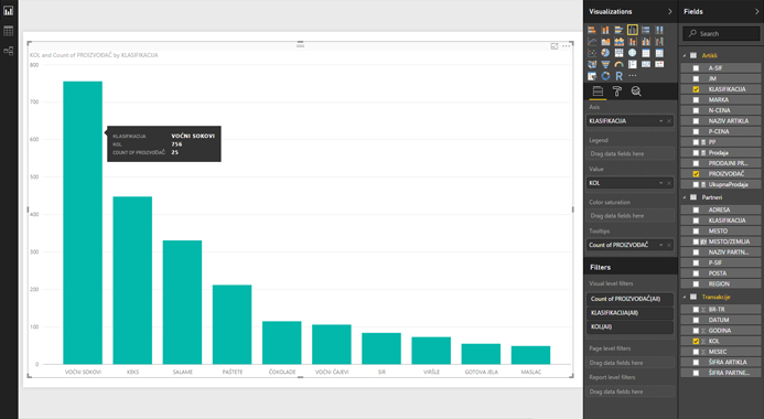
To create simple charts, most of the time we’ll use the Column Chart or Bar Chart. Depending on how we want to display a series of data, we will use one of the subtypes: Clustered (clustered series), Stacked (joined series) or 100% Stacked (joined series where its size is shown as part of a total). Whether you are using Column or Bar is often a matter of personal taste. However, when you show series with long titles that describe data, I advise you to take advantage of the Bar Chart for better visibility. The chart is formed by dragging the dimensions in the Axis and Value fields. In addition, we can display another series of data by dragging dimension to the Legend field. Color Saturation field can be used to change color saturation of a series. For example, if series shows sales, by dragging margin to Color Saturation we will emphasize those series on the chart where we have a larger margin.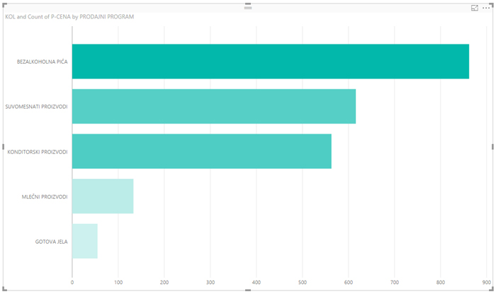
PowerBI also has visuals that display reports by using geographical data. Field Place at these reports is used to dragging reporting dimensions that contain list of places where data should be shown, and the corresponding values are shown in the Size field. To assign a location, we can also assign Latitude and Latitude fields.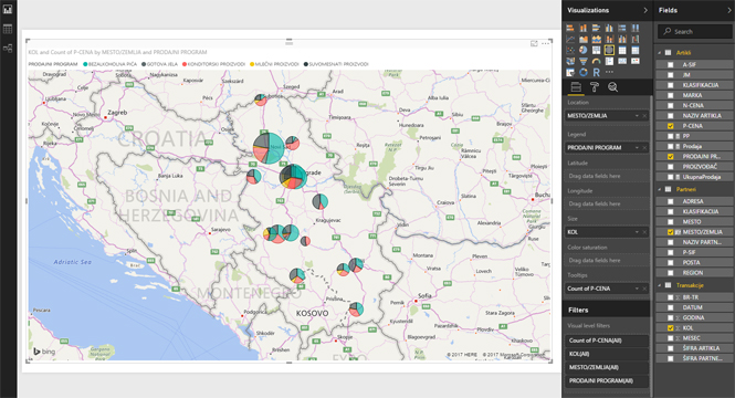
In traditional reports, if you position mouse above the data series, a tooltip will be displayed, showing some additional information. If we want to show more information within a tooltip we might drag some additional dimensions into the Tooltips field.