Power BI Sparklines
Sparkline is a chart that is located inside the cell and shows the change in value over a given period of time, and is suitable for observing trends. It can be a Column or Line chart. This way of presenting data has been in Excel since version 2010, and has recently become available within the Power BI Desktop reporting platform. In the text that follows, you will find out how it is added and changed …
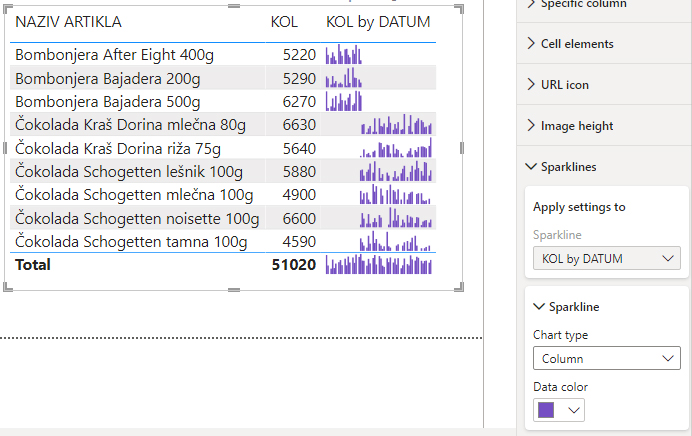
We will start from one simple Table visual within which you can see sales by item names as well as total sales. After selecting it, you need to go to Fields and right-click to open the context menu. Then select the Add a Sparkline option.
A window will appear in which we enter the settings for creating this chart. The Y-Axis field serves to add the value we want to analyze. It can be quantity, amount, difference in price, etc. In this example we will choose the dimension KOL (quantity). Then in the Summarization field we select the type of aggregation. There are several functions which are offered here. We will select the SUM function. Finally, in the X-Axis field, we choose the dimension on the basis of which we perform the analysis, which is usually a date field. In this example we add the DATUM (date) dimension. By clicking the CREATE button we’ll complete the creation of the sparkline chart.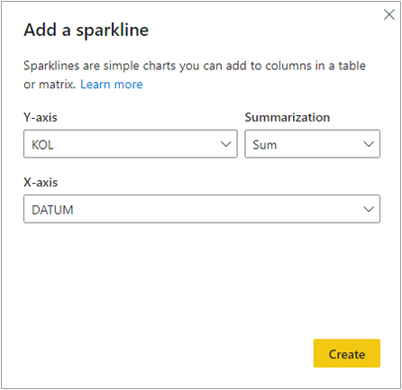
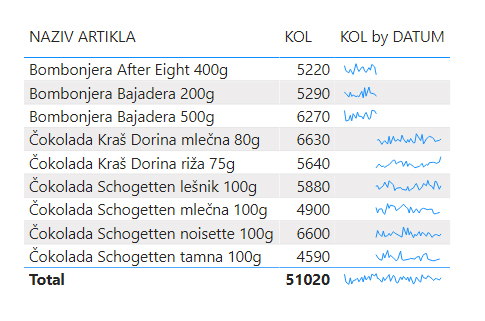
If we go to the visual formatting menu we will see that there is a Sparkline section there. Within this section it is possible to change the type of a sparkline (line/column) and color of the chart. In the case of a line chart, it is also possible to change the line width.