
Speedometer
When analyzing key performance indicators (KPIs) for their display is often used a gauge that resembles a speedometer in a car. This is not a standard Excel chart. There are commercial add-ins used to create this type of chart that could be found on the Internet, but there is a technique to create it by combining and modifying the existing charts of Doughnut and Pie Chart.
The speedometer gauge consists of two building blocks. First, there is a background where we should mark the red, yellow and green zone. It aims to show us whether the observed performance indicator is within given limits, and the background is created by data about zone sizes which give the number 100 in total. Remainder (“below the horizon”) that has a value of 100 and represents part of the graph we will not see, because the background of the speedometer is a semicircle. The second building element is a cursor (needle), and it consists of the KPI value, the width of the cursor (value 1 or 2), and the remainder that represents the difference between the value and the width of the cursor to the number 100.
We begin by selecting the first table, with the values for the speedometer background, and then clicking on the Insert ribbon and selecting the Doughnut chart type as a subset of Pie charts.

 A simple doughnut chart will appear, where we can immediately create the title, e.g. “KPI”. Then we need to select a chart, so right-click on it and in the context menu select the Format Data Series option. On the right side of the screen, a menu will open where we can see three sliders. The first (Angle of the first slice) represents the angle of the first value. By moving this slider, we make the rotation of the “donut”. If we give him a value of 90, the chart will be so positioned that the part that should be invisible is from the bottom. The third slider (Donut Hole Size) is used to adjust the width of the doughnut chart. It is not necessary to change it, but in this case, we gave him 65%. Finally, it is necessary to select the individual values of the series and give them the desired colors, with the value of „below the horizon“ to be transparent, with a transparent frame.
We continue with making a cursor of speedometer. We will select a second table and create a pie chart, similarly as when making the first chart. Choose the Format Data Series option, to adjust the graphic rotation and the slider value Angle of the first slice is set to 270. The pointer will be colored in black, and the other values in the graph will be made transparent as well as the background of the chart itself. Furthermore, it is only necessary to change the position and size of the chart so that the cursor is stationed exactly above the center of the first chart, in order to get the same effect as if we are looking at the speedometer in the car. Finally, for a better visual effect, we can add a rectangle painted with a gray gradient of colors behind the charts.
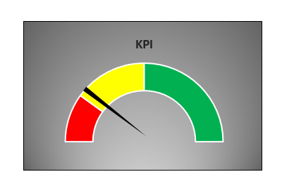
The speedometer is over! Changing the KPI value automatically (marked with a yellow color in the second table) will be used to move the cursor on the speedometer.