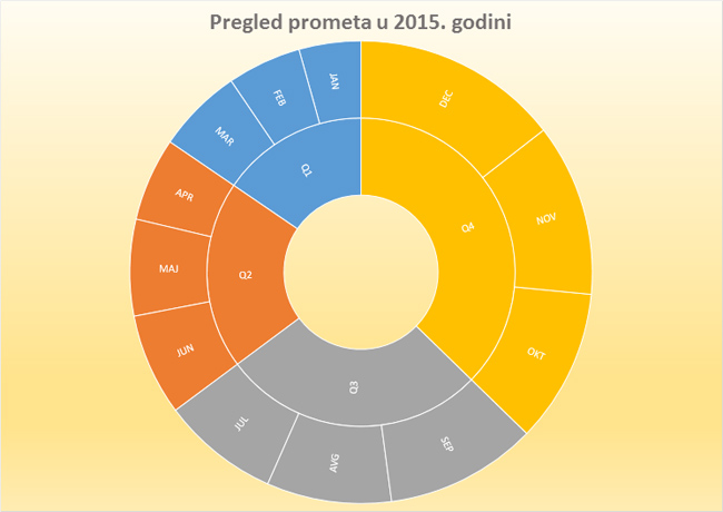
Sunburst
Sunburst is another new chart brought to us with Excel 2016. It is suitable for displaying sales values (traffic, earnings, merchandise, etc.) according to periods, arranged by hierarchies such as: years, quarters, months, days … It reminiscent of a Doughnut Chart, because the width of the ring shows the value that we want to present. It differs in showing several rings, each corresponding to one of the hierarchies.
To show how this chart is made, we will create a three-column table. The first should contain the names of the quarter (Q1, Q2, Q3 and Q4), other names are months, and the third value of the turnover in euros. Select all the values in the table, and then in the Insert ribbon find the Recommended Charts option. After it launches, a dialog window opens, in which we first need to click on the All Charts tab. In the list of chart types we will find the Sunburst option, and then we need to click on the OK button.

When the chart is displayed, we will see turnover in a given period displayed on a circle with two rings. The inner ring shows turnover per quarter, and external traffic by months. Ring width shows traffic value.