Histogram

Histogram is a diagram that is used for the graphical presentation of the statistical distribution of  values. It consists of columns, arranged in descending order, which represent the frequency of their repetition. Excel 2016 provides the ability to create two types of charts: Histogram and Pareto. Pareto differs in that it is a combination of two charts: columns and lines. Columns show values, and the line illustrates their cumulative growth.

Waterfall chart

The Waterfall Chart is a report that is often used in controlling, and is ideal for displaying inflows and outflows of money over a given period of time. On this occasion, it usually shows the situation at the beginning and at the end of the period. Earlier it was done as a combination of two series of data, one of which was specially formatted in order to get the effect of the “waterfall”, and from the 2016 version it can be made directly from the Excel.

“Waterfall” for the “poor”

Waterfall Chart, also known as the Bridge Chart, is a convenient way to show the cumulative effect of the growth or decay of data in the initial and final set value. From the 2016 version this chart has become an integral part of Excel, but it can also be done by creating specific formatting of data series combinations. It can be said that this text will be about “Waterfall” chart for “users with cheaper tickets” …

What’s your personality type?

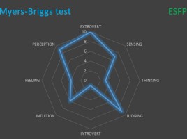
Myers–Briggs test is the one you have probably already met on some of the job interviews, when completing the test where it seems that questions are repeated. It is a personality type indicator, on the basis of which the respondent is classified by four types and two subtypes: an extroverted-introvert, experienced-intuitive, thinking-feeling, judging-perceiving. The ideal tool for displaying the results of this test is the Radar chart.

Win-Loss chart

If you are engaged in budgeting and cost analysis it will be useful to know how to create a Win-Loss chart. This is a type of Bar Chart chart which, on the left side, holds negative values (most often the losses), and on the right side positive values (most often the gains). On the left side there can be also shown the costs, and on the right side the revenues. Let’s take a look at how this chart works!