Geography & Stocks

Excel has not changed essentially from its origin, and one of its features is that it does not have data types other than text and numbers. All other (derived) types are only differently formatted numbers. In this respect, Excel 2019 (O365) brings two new types: Stocks and Geography. Since it is unlikely that any of you will be trading on stock exchange, this “recipe” will most of the time deal with geographical data and their application.

Creating Pivot tables

Pivot tables (Pivot table reports) are a tool for creating interactive reports based on the range of selected data or structured tables. Columns from source tables are used as reporting dimensions by aggregation of data (measures) or using them to analyze in rows, columns, as filters (dimensions) … Once made, the Pivot tables are easily changed by adding or removing dimensions, giving us more different look at the unique original dataset.

Data consolidation

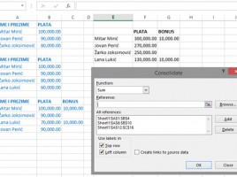
Consolidation is the term that denotes the unification of several parts into a single entity. In practice, we use consolidation when we want to receive a summary report; for example, when we want to summarize the sale by months, quarters, years … The simplest way to do this is by summarizing the data entered in several worksheets in the last sheet using the formula. But what if the data in the worksheets is not uniform? Excel also has a solution for this scenario …

Secondary axis

When we make charts that contain multiple data series, it happens that the data in them varies greatly, in terms of value ranges, or they are set in different units of measure. Also, we will sometimes want to show different series by using different chart types. For this purpose, we choose whether the series is displayed on the primary or secondary axis, and which type of chart we want to use to display the data on it.