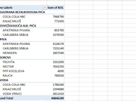
Views on the pivot table

The end of the old and the beginning of the new year is often a reason to look back. I read this post a while ago and it seems that I could have clarified one of the things better. There are many different views on pivot tables, and as Nectar’s advertising slogan says, “It does matter” In this “recipe” we will deal with each of them, after which you can decide for yourself when to apply which view to get a suitable report.

Allow multiple filters per field

If you run the Pivot table options (Analyze/Options), in the Totals & Filters section, you will find the Allow multiple filters per field setting. It allows you to apply text filters and number filters simultaneously for the reporting dimension, which can be displayed in rows or columns. This feature could be useful, let’s see how it works!

Arranging filters in a pivot table

In one of the previous posts, there was a general mention of pivot table options, and in the next few “recipes” we will address some of them that are important and can make our daily work easier. Filtering the pivot table is achieved by dragging report dimensions into the Filters field. How can we influence the number and layout of available filters in the pivot table?

Word frequency

How often do repeat certain words in the given text? Which one of them is most often repeated? The answer to this question can be obtained using a few simple techniques, which will be more talk in the text that follows. To begin with, a news post is taken from the link http://www.iib.rs/srl/bizit2018-srl/and we will analyse it to measure the frequency of words occurrence. The selected text should be copied to cell A1 of the new worksheet.

Pivot table bins

When we create a pivot table report, based on statistical data, it’s sometimes convenient to group them into bins so that we can analyze them more easily. In one simple case, where we research the age of the respondents and the answer to the question whether they are smokers or not, you will see how the groups (bins) are made and how can we later use them to create beautiful charts.