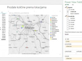
Maps in Power View reports

If Data model contains some universal geographic information (name of city, region, country, etc.) we can use them to create a chart within Power View. It enables creating maps based on Bing maps, after it automatically turns on the mechanism for searching and comparing geographical data from the model with the database of geographical locations. Maps are part of Power View reports ecosystem and they make a great supplement to the reporting panel.

Power View

This is a tool for creating homonymous graphical reports, built on of Microsoft Silverlight technology, and based on data from the Model. It allows creating rich graphical reports that show tabular data, charts, time-oriented charts, maps… Interconnection of its elements makes it an effective tool for making dashboards, and can be used for creating similar SharePoint reports.

Advanced Data model options

In addition to options we use on daily basis Data model has some advanced options too. With them, we can define the perspective view on the table. Also, we can determine the behavior of columns when they are dragged in the Pivot Table, as well as to set additional attributes table that can be used when creating reports. Finally, it is possible to make one or more synonyms for each column, which later makes it easier to search the model.

Data model

Data model is used to add and connect tables in a whole, in order to retrieve the data needed for reporting. This is a pseudo-base, part of Excel document. By adding a table into the Model data are automatically compressed; later, when we need them for reporting, they are decompressed and used as a reporting dimension in the pivot table. Data model is basis for use of “Power” technologies, i.e. “self-service” business intelligence tools.