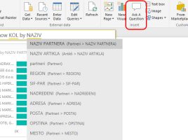
Analyze Data

A few years ago, Excel, which comes as part of a Microsoft 365 subscription, got the Ideas option. Now this option has been improved and is called Analyze Data. It enables, with the help of artificial intelligence, simple and fast data analysis to generate tables, pivot tables or charts according to user questions, which help user to visualize data in appropriate business reports.

Related questions

In one previous „recipe“ there were words about the Q&A feature that Power BI supports. Since November 2018 it has been upgraded so that it is now possible to “ask subquestions” which represent a modification of the initial query. Also, this option also allows you to track the question history so, in that way, you can make interactive reports that users will adore.

Buttons

Appearance of the report is no longer only important thing, but also its interactivity. Therefore, new feature – buttons are added to PowerBI. These are graphic objects intended to give you a step backward, if you drilldown within the report, to launch a report that is recorded as a Bookmark or display a table/chart that was created as a result of a pre-designed question.

Asking questions

Power BI users have long been able to, by entering a question in a specially specified field, create a report that, by combining the reporting dimensions and measures, answers the question asked. Recently this option has been enabled in the Power BI Desktop application. Home ribbon now, besides the usual „New Visual“ option, also contains „Ask a question“. Let’s see how it’s used!