
Marking the best-selling item
When we create a column chart to visualize data, the columns are often of different heights. We evaluate where the best sales were achieved visually or add data labels and then make the conclusion based on the appropriate numbers. Excel does not yet have conditional formatting for charts, but there’s a trick you can use to automatically determine the highest value in a series.
Let us start with a simple table that has two columns where the name of the item and the value of the sales are displayed. We used this table to create a column chart.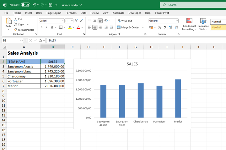
As you can see, it is obvious that Merlot is the best-selling item, but if we compare the first two in a series it is a little more difficult to spot the difference, right? We are going to add another column to the table and here enter the formula:
=IF(B3=MAX($B$3:$B$7); B3; 0)
This formula checks, for the current cell, whether it represents the maximum value in each range. If it does it displays the maximum value. Otherwise, it displays zero. Let us copy the formula to the remaining cells in the column.
Now, if we add this column to the chart, which is easiest to do by copying the contents of the column (CTRL+C) and pasting it above the series in the chart (CTRL+V), you will see the largest value next to its counterpart from the first data series displayed in red.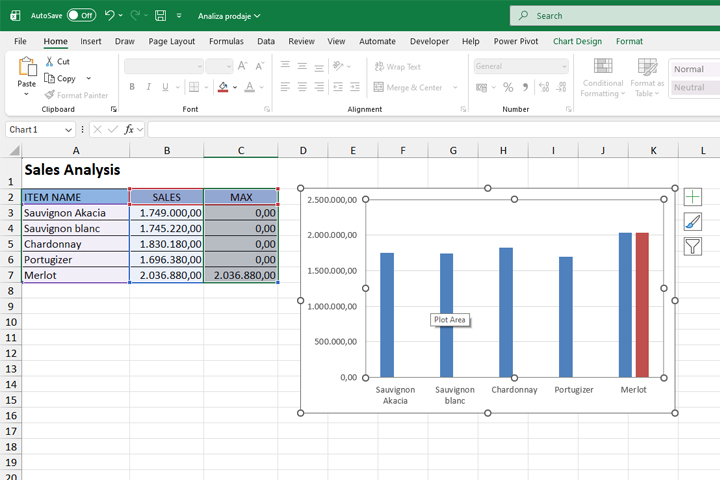
Now we just need to set the series to overlap. Select the red column, then select the Format Data Series option, and in the panel on the right, set the Series Overlap value to 100%.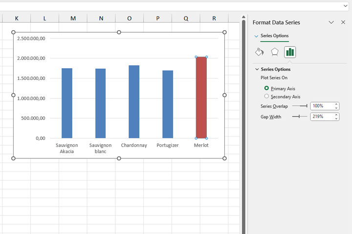
In this way, every time the maximum sales value changes, the column that represents it will be shown in red.