ABC Analysis
ABC analysis is a method used for analysis and management of inventory. Depending on the share in the total value of the stock it distributes items in groups A, B or C. They make up about 70%, about 25% and about 5% of the total, respectively. Since items from Group A account for the largest share of the total value they require frequent and rigorous control. Items from the group B require something smaller, while items from the group C require the least control.
To begin with, we need a stock list. This is the report (table) comprising article name, unit, quantity and price. At what price will keep stocks depends on the policy of the company (weighted average, FIFO, LIFO) and it won’t be further discussed in this article.
First, let’s add column VALUE that is calculated as a product of QTY and PRICE. In cell E2 we should enter a formula:
=C2*D2
and further copy the formula to the remaining cells within this column. Then, we’ll sort entire table by VALUE column, descending.

Next step is to create a column that will contain running totals. We’ll add column description RT in header (F1). Then we should enter value to F2:
=E2
And further enter a formula in F3:
=E3+F2
By copying this formula to the remaining cells within column we’ll get running total. Next, we’ll add another column and name it RTP which should contain quotient of every value within RT with total value of the stock which is contained in cell $F$21. We’ll enter the formula in G2:
=F2/$F$21
and then copy the formula to the remaining cells within this column.

At the end we should create column ABC which should contain ABC classification. We’ll do that by entering the formula in cell H2:
=IF(G2<0.7,”A”,IF(G2<0.95,”B”,”C”))
and then, off course, copy it to the remaining cells within a column.
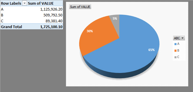
Now we know which item belongs to which group. In the end, it would be good to show it in a chart. The best way to do this is to create a table based on the PivotChart by starting eponymous option from the Insert ribbon. Furthermore, we should add ABC column to Rows of the Pivot table, and Values to Values section. Then we’ll choose a most suitable chart which is, in this case, Pie Chart because it’s the best tool to show distribution of items within groups.