Funnel chart
The Funnel chart is not a great novelty. In one of the earlier posts there were words about how to graphically represent the sales funnel, and what’s new is that this chart, that previously existed only in Office365 and Office Online editions, became part of Excel 2019. The Funnel chart is most useful when we want to display values (quantities, amounts) in relation to a certain business phase, and how to do it will be shown in the following scenario.
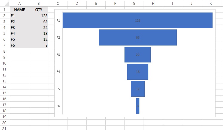
Let’s create a table in which we’ll follow phases of the sale of some business software, as well as the number of clients in through phases. In the first column, the phases will be marked: F1 (entrance in database), F2 (initial contact), F3 (meeting), F4 (presentation), F5 (offer), F6 (contract). In the second column we add the number of clients through phases. If we select a table and go to the Insert ribbon, we can find the option to add a Funnel chart. By performing such action a chart will be shown in which each bar is broadly proportional to the number of clients in the given phase, and from the top to the bottom we see their position, through stages, in the sales funnel.