Group By option

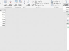
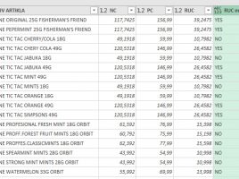
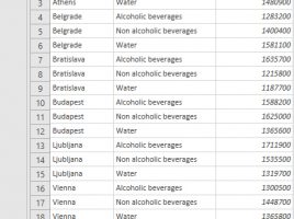
Power Query has features that allow you to group and aggregate data in a similar way as when writing T-SQL structures, without writing a single line of code. Therefore, the process is much faster and easier. Grouping can be done by one or more report dimensions, and the order is determined in a similar manner as when sorting. Also, multiple data aggregation functions are supported as well as possibility of multiple aggregation…

Combining files

Power Query gives us the ability to combine multiple files which belong to one folder. These can be TXT or CSV files, but in practice we will usually combine several Excel files. This is a very powerful option that can save us a lot of time. At the same time, it brings with it some challenges, which you will be able to learn more about in the following text …

INTERCEPT and SLOPE

For a given series we can add a trend line which, by applying the selected mathematical function, approximates and shows the trend of data, which was discussed in one of the earlier posts. By displaying the value of R2 we can see how well we chose the function that approximates the data. How else can you improve the trend line appearance?

Total of chart series

When creating a Stacked Bar or Stacked Column chart, this is a convenient way to show the proportion of a product or its categories sold over a given period of time. However, even if we choose to show values ​​on the series, it is not clear what the total sum is. Here’s a simple trick to create a chart that shows the share of each series in the sum, as well as the total sum of values.

People Graph “for the poor”

In one of the previous “recipes” I wrote about an Excel add-in called People Graph which you can use it to effectively display the results of statistical surveys. You can also create this type of chart yourself if you have some experience with photo editing applications and by applying the technique I will show you here.