Scatter chart
When I was in school, and learning about Cartesian (Descartes’s) coordinate system I must admit I liked it a lot! I was in love with the idea that in the intersection of x and y axes, dots can be drawn, and then they connect to the line and show some trend. It’s been a long time since than, and in the honor of legendary Rene Descartes I’ll be creating a recipe about scatter charts.
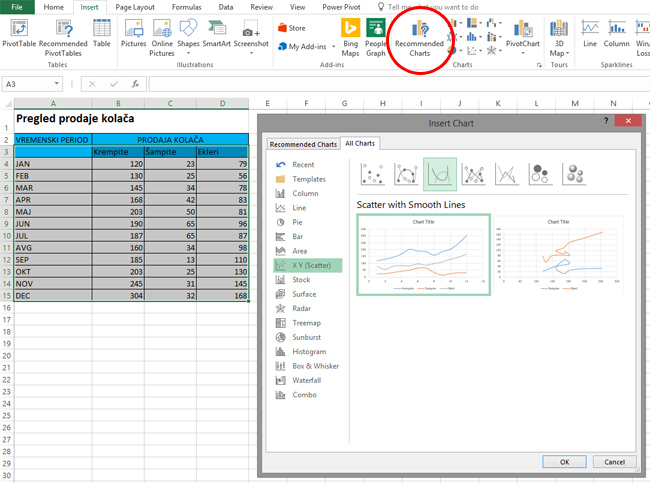
Prior to the creation of the chart, an example should be made with the corresponding data. The scatter chart should be based on data that are convenient to display on the x and y axes. I chose to use x axes for showing a time period, e.g. months, and y axes for showing numerical values. And since, at this moment, I have a craving for something sweet, as an example I’ll create a table about sales of pastry in a period of one year.
We can make a scatter chart in many ways. Whichever one we choose, we need to first select the data in the table that we want to display on the chart. Then, in the Insert ribbon, select Recommended Charts. When you open the dialog box, go to the All Charts tab and select the type of chart “X Y Scatter“. This type of chart has several subtypes, and to choose the one you want to use, click on its image at the bottom of the window. We can select only dots, dots with round lines and markers, dots with round lines, dots with straight lines and markers, dot with straight lines and two types of Bubble charts. At the same time, in the central part of the window you can see how the chart will look approximately after you make it.
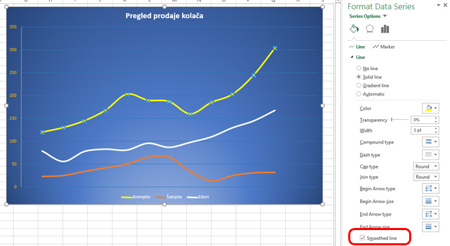
After selecting the desired chart type and clicking the OK button, it will be displayed in the worksheet. To the Scatter Chart, like any other, we can add items such as title, legend, labels, etc. We can also format its elements to customize the desired layout of the chart. If we begin to format some series of data, in the menu on the right we see the Smoothed Line option. The selection of these options gets the oblique lines between the marker points. Otherwise, the lines will be straight. Clicking the Marker tab will show options for adjusting the look (shape) of the marker, so if we did not add it to the chart before, this is where we can do it. Finally, we continue to customize the look until we get a chart that best reflects our data.