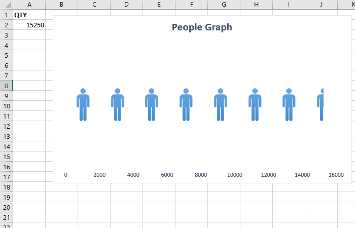
People Graph “for the poor”
In one of the previous “recipes” I wrote about an Excel add-in called People Graph which you can use it to effectively display the results of statistical surveys. You can also create this type of chart yourself if you have some experience with photo editing applications and by applying the technique I will show you here.
To get started, find an icon on the Internet that symbolizes a man, or use the one available since version 2019 (an easier process that we will not address in this text). Then, enter a photo editor (such as Photo Shop) and create an inverse image. Save it as a transparent PNG file.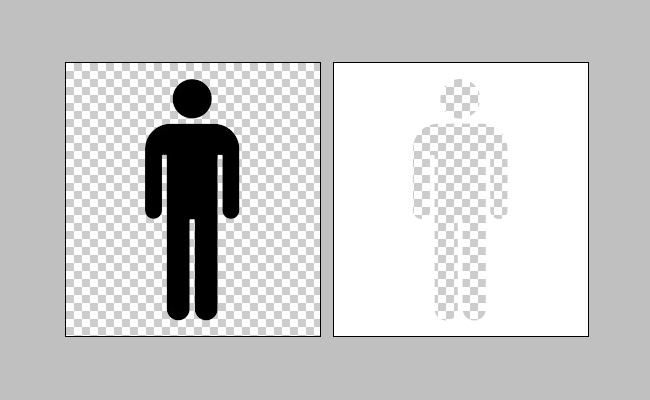
Then get into Excel and create a simple Bar Chart. Format the x axis to be of fixed length, with fixed spacing.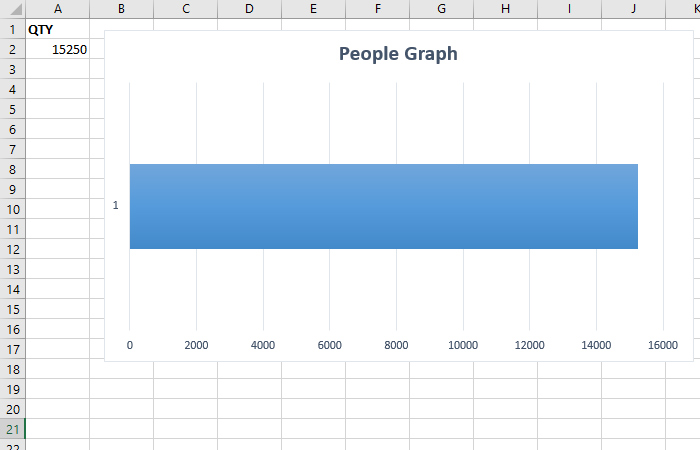
Then add an inverse image and place it above the data series. Multiply it by as many spaces you have. E.g. if the axis goes from 0 to 16000 and you have 8 spaces of 2000 each, that means you need to place 8 images. Align the images first, then group them together. Finally, you need to run the Format Series option and adjust Gap Width so that the images completely cover the series. By using this technique, you have easily obtained People Graph.