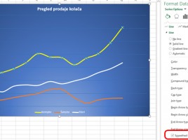
Scatter chart

When I was in school, and learning about Cartesian (Descartes’s) coordinate system I must admit I liked it a lot! I was in love with the idea that in the intersection of x and y axes, dots can be drawn, and then they connect to the line and show some trend. It’s been a long time since than, and in the honor of legendary Rene Descartes I’ll be creating a recipe about scatter charts.

Speedometer

When analyzing key performance indicators (KPIs) for their display is often used a gauge that resembles a speedometer in a car. This is not a standard Excel chart. There are commercial add-ins used to create this type of chart that could be found on the Internet, but there is a technique to create it by combining and modifying the existing charts of Doughnut and Pie Chart.

Creating Gantt chart

Gantt chart s a chart type used to track project realization through phases, so we can see when the activity starts, how long it takes and when it finishes. It does not exist as a standard chart, but it can be created by modifying the Bar chart. In the following text, step by step, you will be able to find out how to create such report.

Difference in dates

In one of the previous “recipes” you could find out how to calculate the number of past days between two dates. Excel has another function that can be used for this purpose. It is a hidden DATEDIF function, which, for two given dates, can calculate the number of years, months or days. The following text will be about how this function is used …

Arranging secondary axis

In one of the earlier texts there were words on how to take advantage of the secondary axes to display disproportionate data series. The common problem here is the overlapping of the series. Therefore, the data is not sufficiently noticeable. By adjusting the width and gap between the series it can be slightly corrected. However, in order to make the data on the graph more noticeable, one can use a trick that will be described in the following text …