Sales return analysis
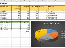
Sales return is an event when good are returned from the buyer to the supplier for one of the following reasons: wrong orders, more goods delivered than the requested, damaged product, damaged packaging, expiration of the term … By analysing the cause of the reimbursement we may , for a longer period of time, to decide what needs to be done to reduce their number to a minimum.